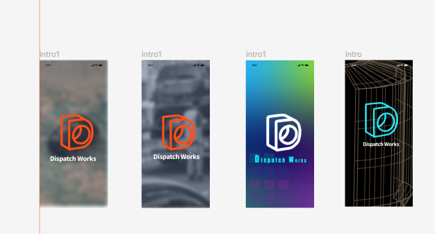
Main goal and my role: Redesigning logo, sign up/log in page, User experience/UX/UI design, navigation flow, interaction design, log in page low fidelity, high fidelity design, Figma, Illustrator, Figma plug ins.
The most rewarding work - why? Have you waited tow truck on freeway or middle of no where in mid-west?
The most rewarding work - why? Have you waited tow truck on freeway or middle of no where in mid-west?
This company want to improve customer's waiting time and provide better communication between drivers.
Stake holders keep telling me no pastel colors, drivers need to see the message at night and able to read.
Design solution: Dark mode with color panels to distinguish message from other drivers or dispatch towers.
Stake holders keep telling me no pastel colors, drivers need to see the message at night and able to read.
Design solution: Dark mode with color panels to distinguish message from other drivers or dispatch towers.
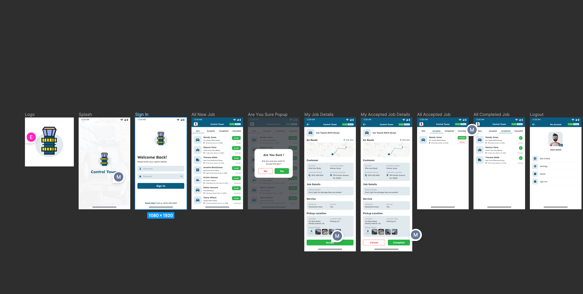
Before the redesign. Previous design with call tower logo.
1. Visual impact: Most clients are very sensitive to changing the whole visual logo but app function itself didn't really communicate anything about the tower look.
2. Usability issue: Previous design had light mode, white back ground but developer requested to create darker mode version for night time dispatcher workers for better visual accessibility, no pastel colors but more robust design. Visual design that will pop during the night time.
Still in progress.
I love revamping logo/branding. App logo is different than web design. It has to pop in smaller screen.
