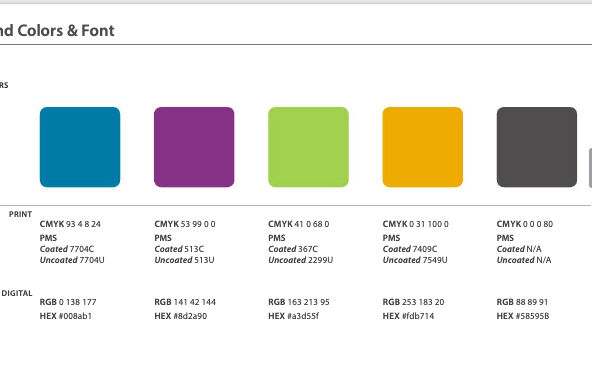
Creating annual impact report for Healthnet of WM-Creating animated graph and 3D pie chart that shows minority race percentage (0.1%, 0,4%) to 46%
Click here:
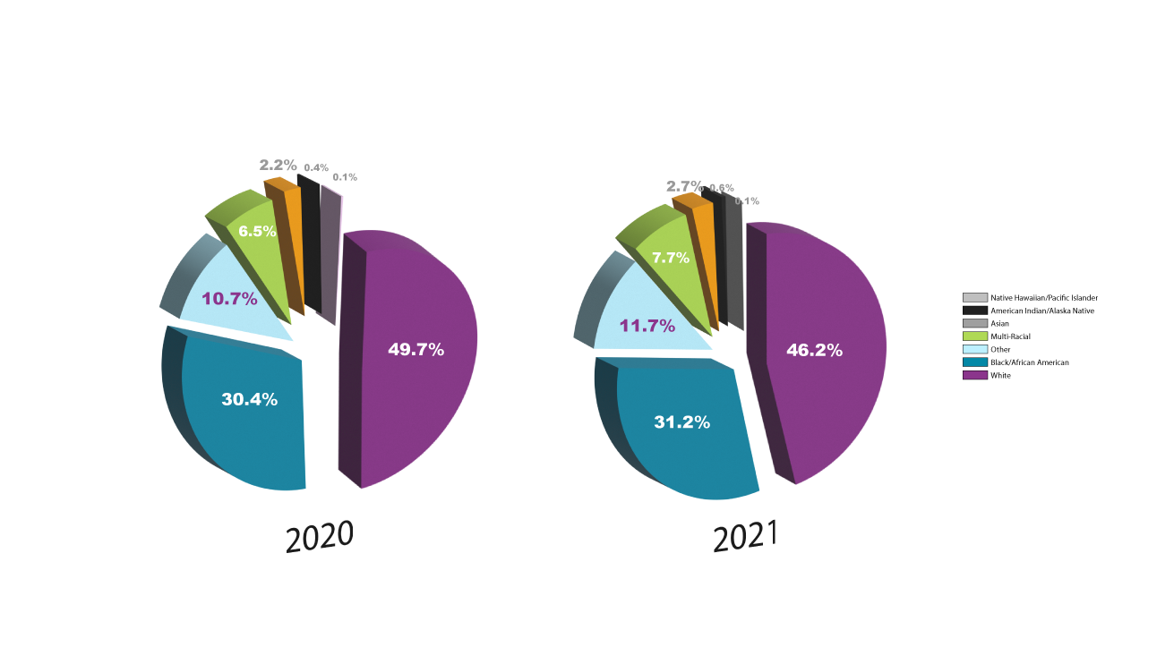
XD interaction movie only work with up to 5 types. When I add 7, it didn't show up well interaction wise. Same thing with bar graphs.
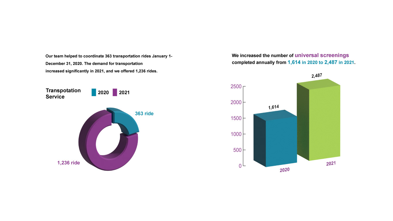
Annual Report graph. Comparison of 2020 and 2021.
When there is a huge difference, it's exciting to make pie graph or use 3D affect.
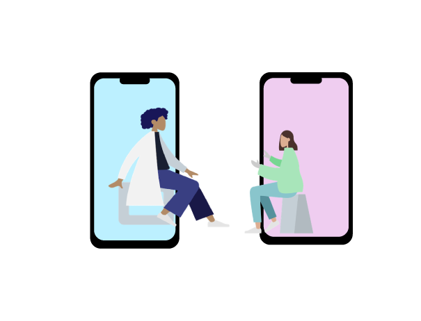
Creating user friendly virtual meeting iconography illustration.

Creating illustration content that cohesive with brand color kits, data map, encouraging inclusive, accessibility driven health care system in Grand Rapid, WM.