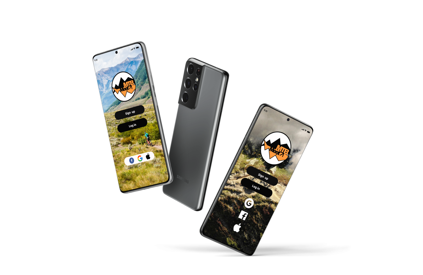
Mock up created in Figma. 3D plug in for android.
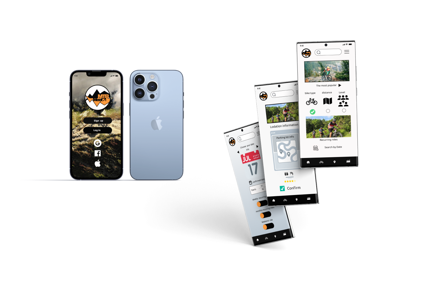
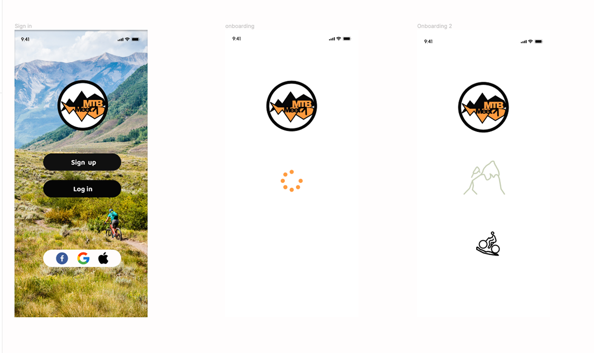
Mock up design in Figma for iPhone. So much easier than Adobe Illustrator or XD.
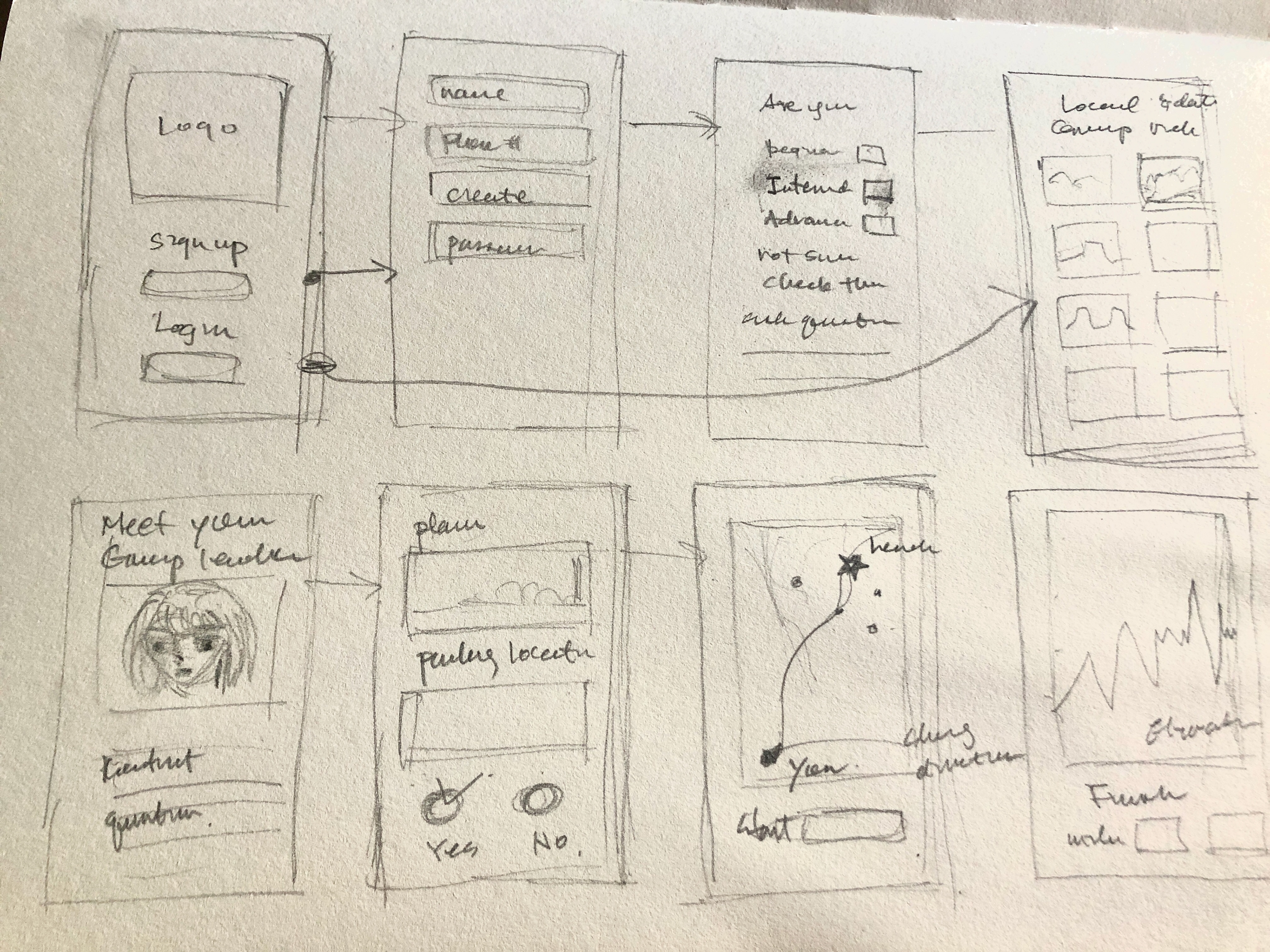
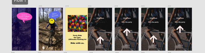
Sketch interaction flow for the app, research and conducting interviews, creating persona.
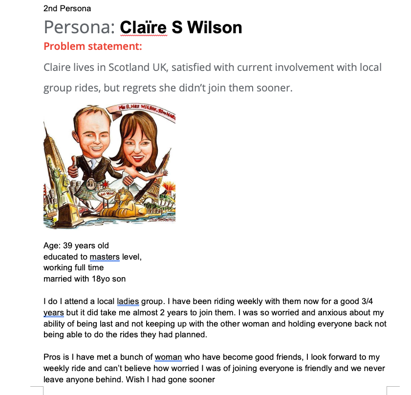
Persona and interviewing 5 participants.
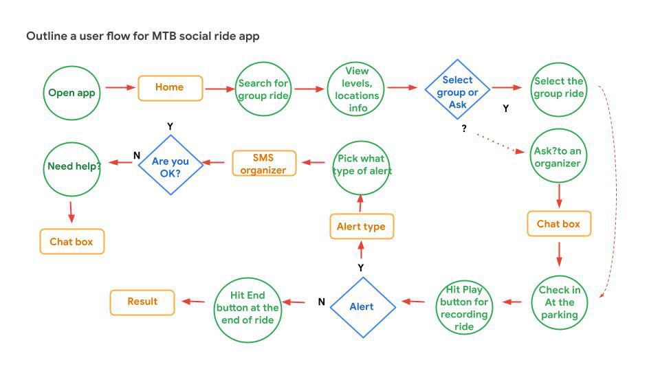
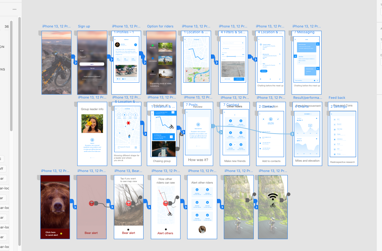
Low fidelity interaction flow in Figma. Usability study research with 4 people. Different riding level, age group. and locations.
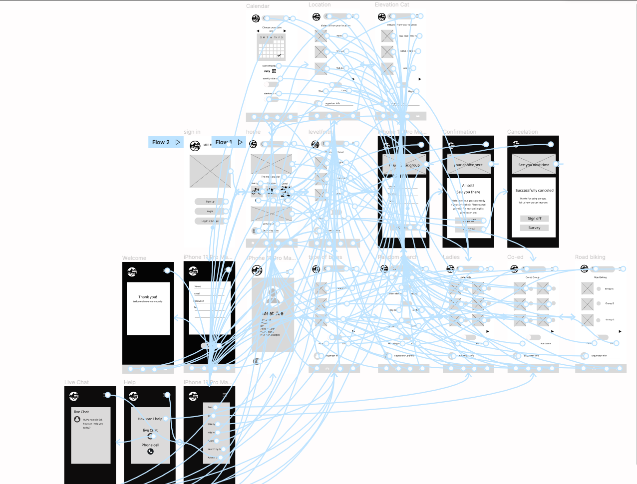
Low Fidelity prototyping in Figma
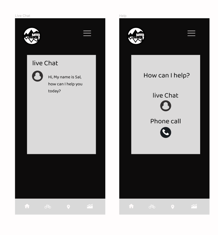
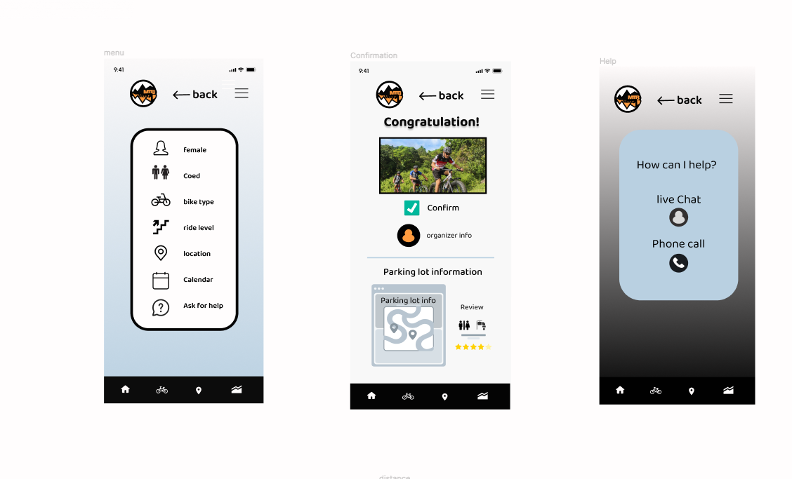
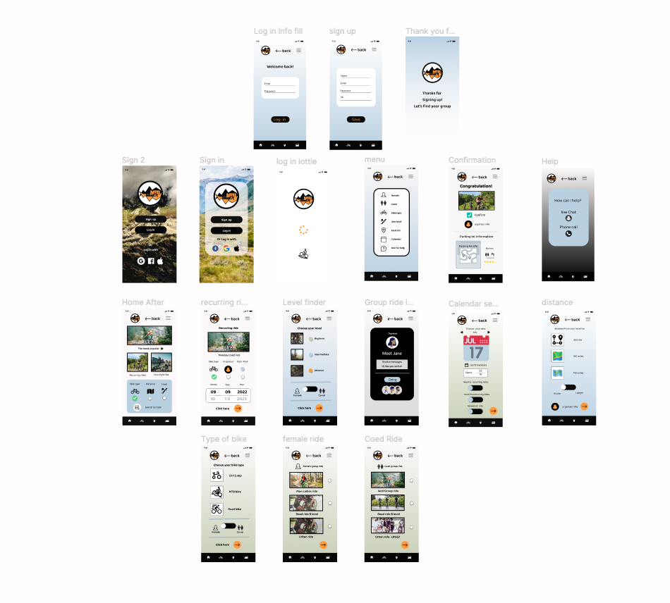
Adding more pages for usability flow. live chat/contact and group leader info, other rider's info.
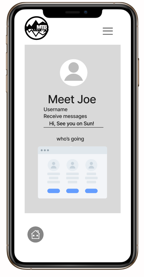
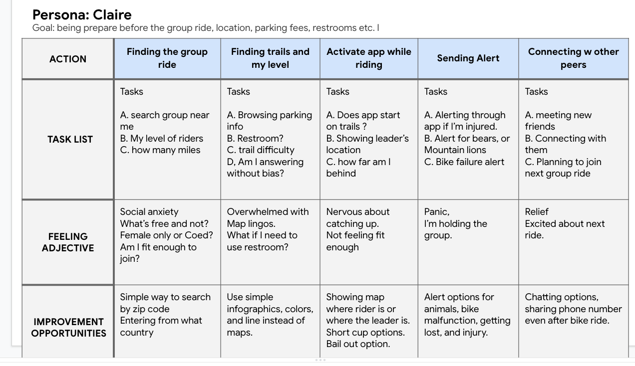
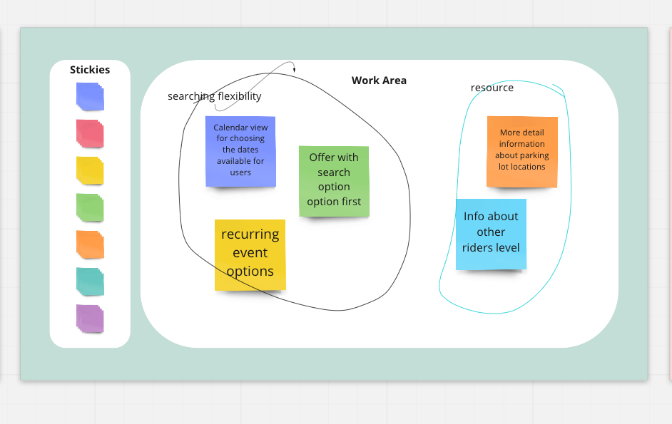
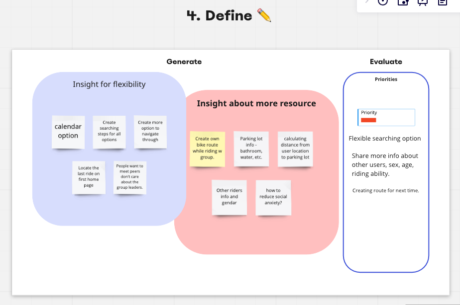
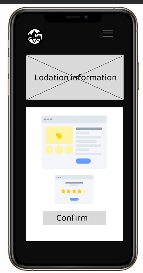
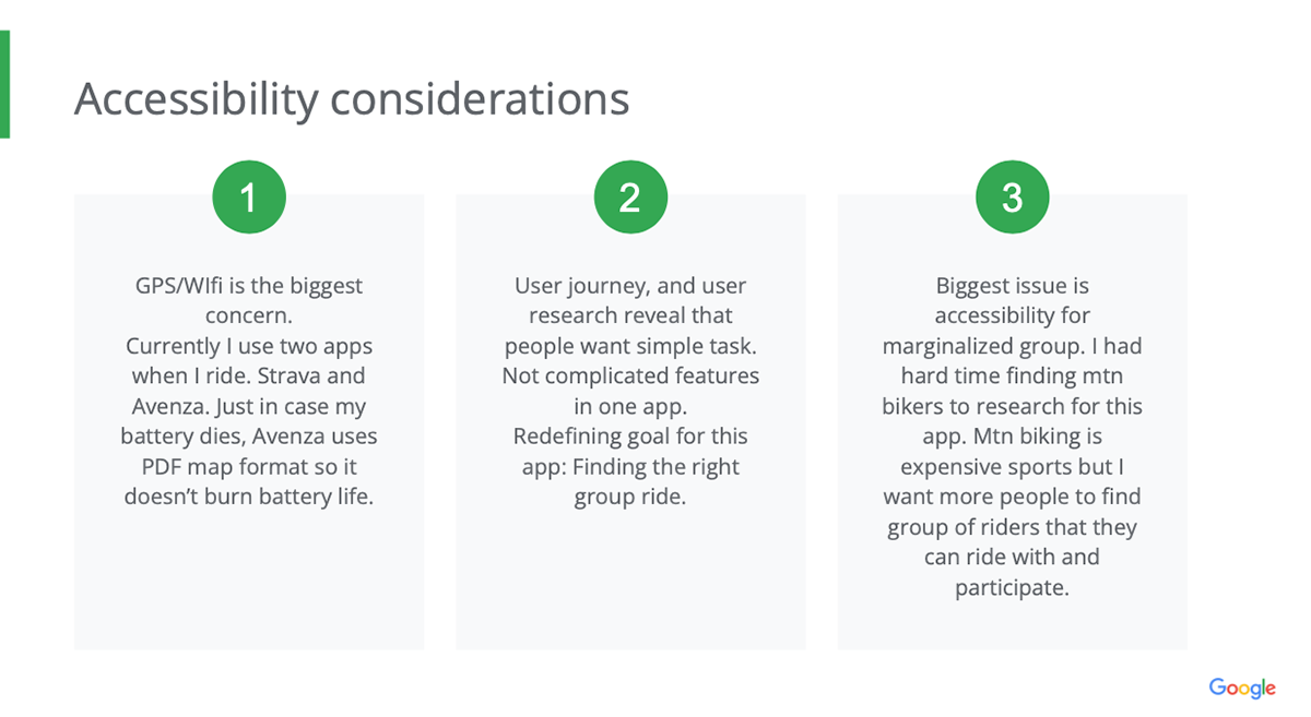
Adding some pain point P0 issues with calendar not showing up while prototyping, Research study insights were implement to new prototyping design - adding parking lot informations, social interaction part. Low fidelity design and sharing info with other designers were much easier with Figma.
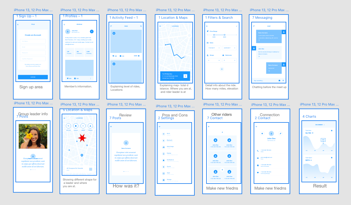
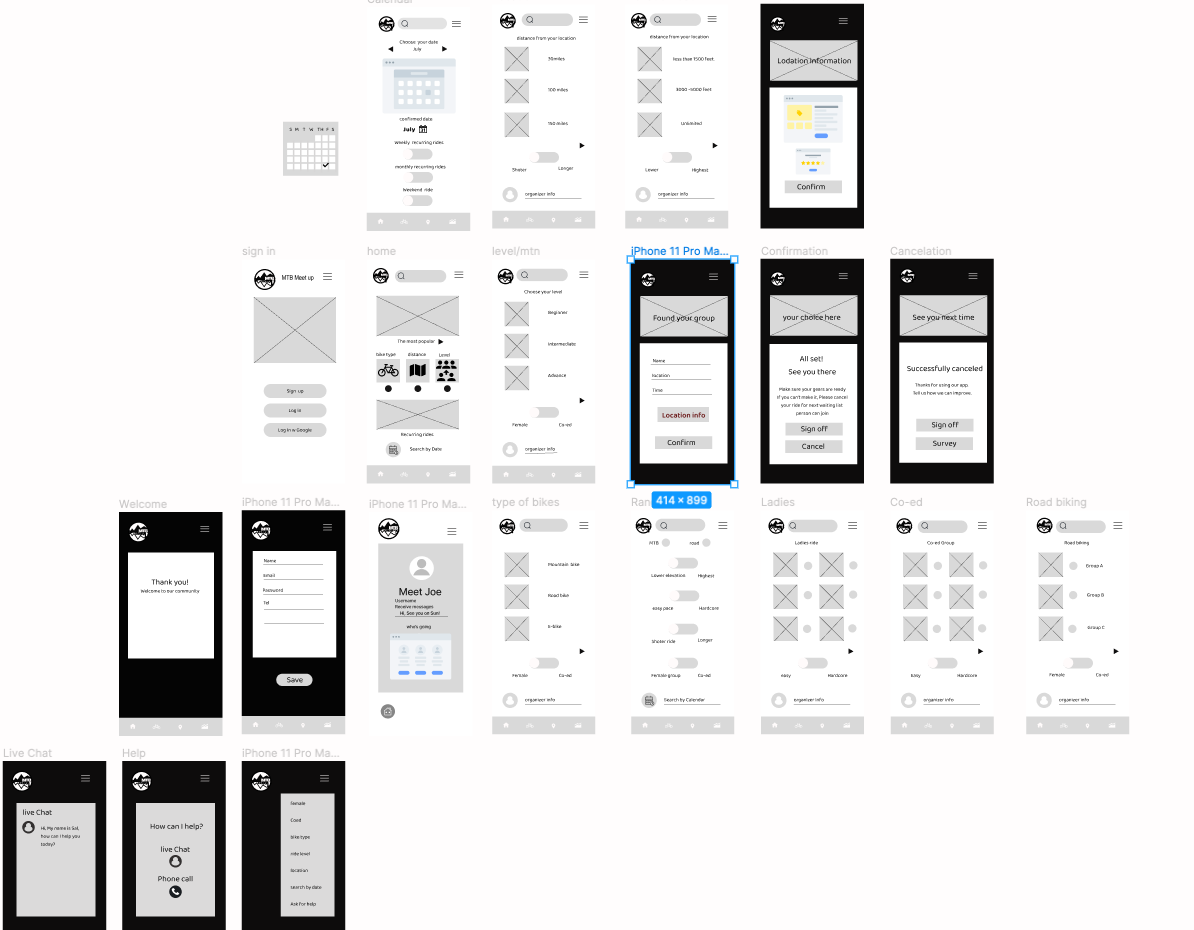
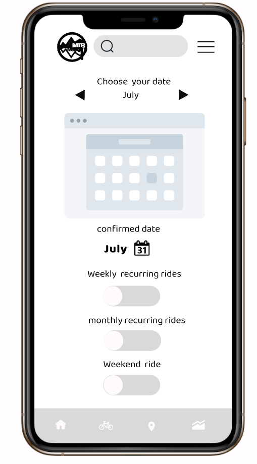
Confirmation page and calendar page were added after 1st usability testing.
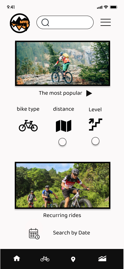
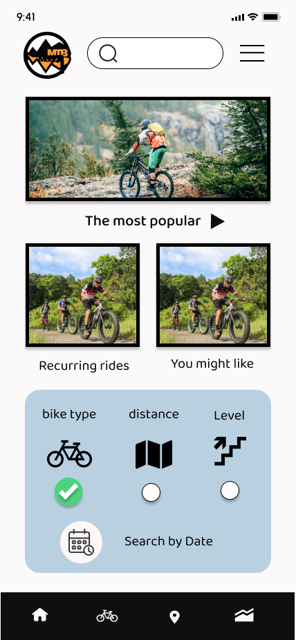
Home page redesign after usability test. Reorganized categories for better user flow navigation.
Low fidelity prototyping in Adobe XD. Easy to use template but prototyping isn't smooth. Videos and Lottie files work better in XD for typography animation, or over all transitions of videos.
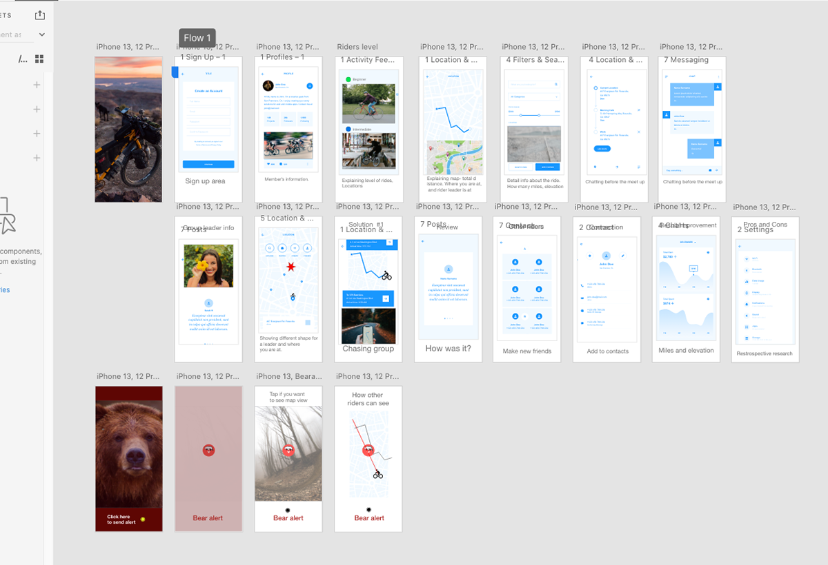
deleting some options like Animal alert and trail location. Most riders have harder time finding the group, initial stage. I have to focus on the mail goal of this app. I can add features later but first goal has to be excited first before users get too confused.
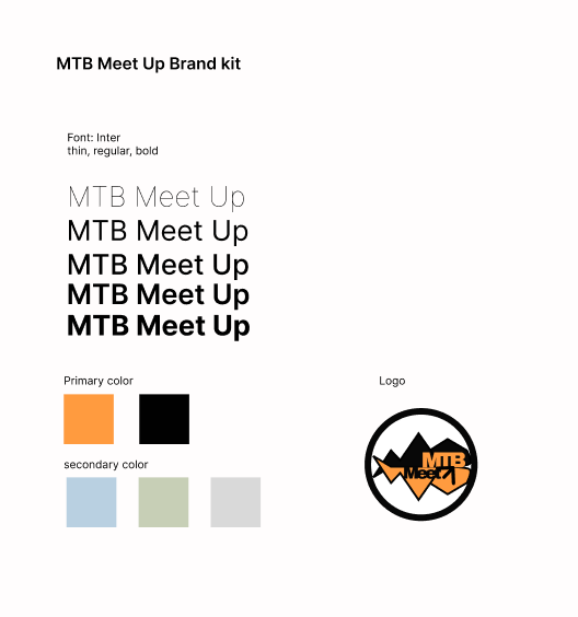
Mechanical design/Brand kit. Typography and color theme for the app and logo.
After 2nd usability test, two developers suggested that log in pages should look different. Log in and sign up both have different fill area and social media log in should be more faster and smooth. I added Lottie animation.
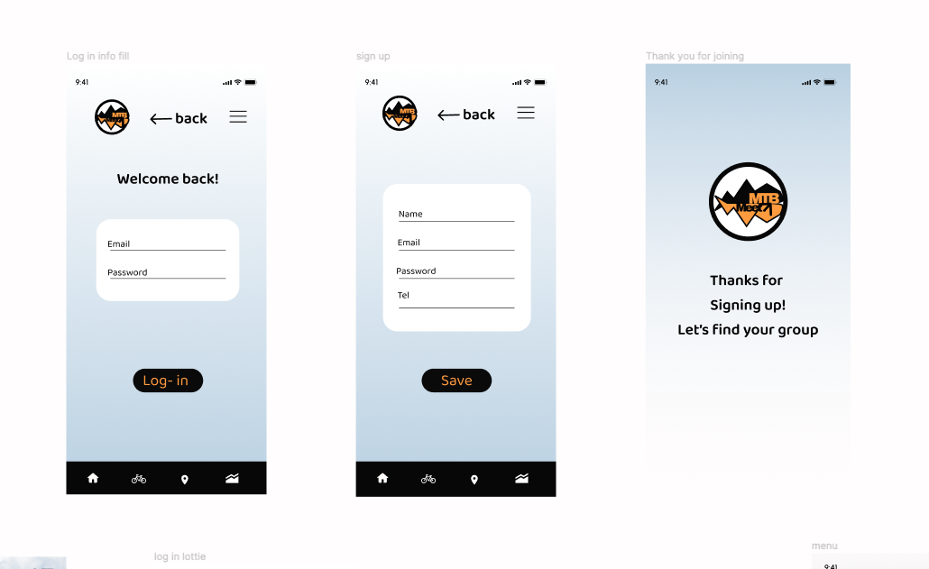
Hamburger menu was added and Confirmation page was redesign with parking lot info.
modifying some pages with calendar option, recurring ride, option to choose female or coed group ride option.
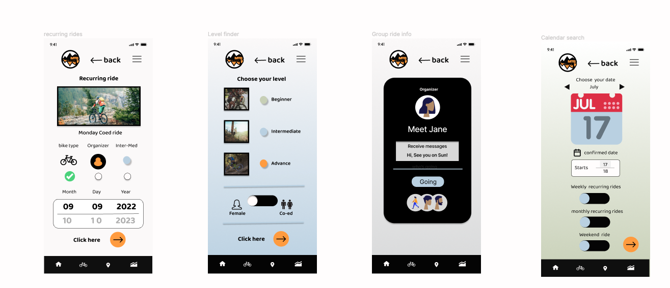
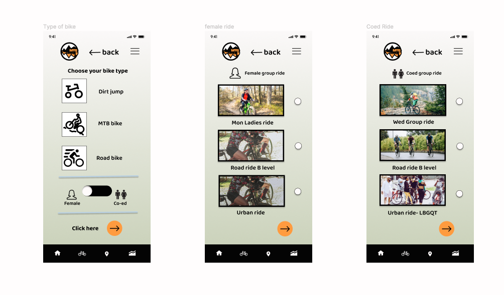
Added few more option pages- bike type, Female and Coed ride option, LBGQT friendly ride.
https://www.figma.com/proto/kGTF2fx9LtAcq1vj4RSME9/mtb-app?node-id=150%3A601&scaling=scale-down&page-id=150%3A600&starting-point-node-id=150%3A601&show-proto-sidebar=1
What I've learned from this project. Never fall in love with the first idea. It usually sucks and no one understands it. After 2 iterations cycle, 2 usability testing, most users can finished the task. Conversion happens.